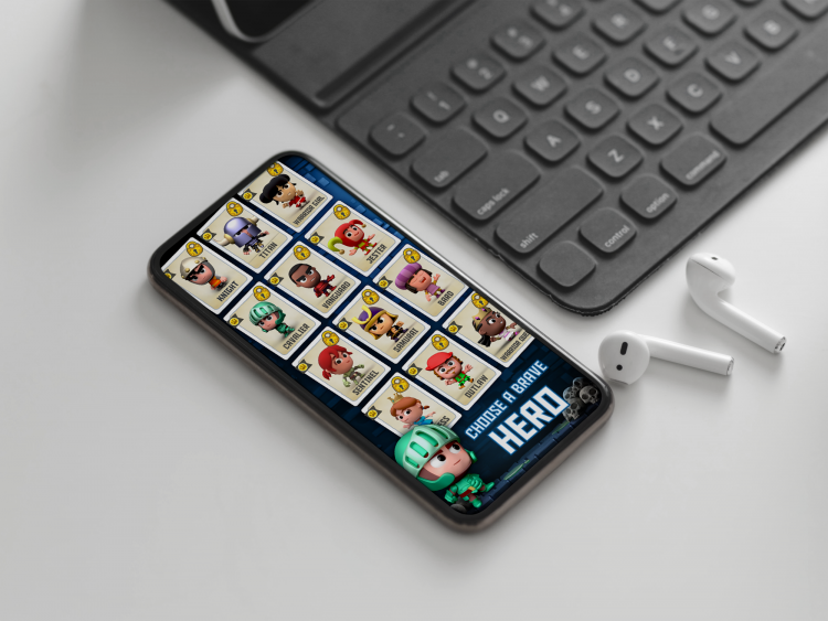
I mentioned recently that we were able to get 20% more downloads by simply removing the preview video from Dungeons of Doom’s App Store page. But what about the game’s screenshots? Is there anything we can do to them that might bag us a few more installs? Well let’s look at a few things we tried.
There’s a huge amount of detail in each level of the game, but I was always worried that that detail might be hard to read at a glance in a screenshot. You’ve got to remember that any potential users will spend just a handful of seconds looking at your screenshots before deciding whether to install or look elsewhere. If they can’t decipher what they’re looking at then there’s a good chance you’ll lose them.
To test this theory I decided to create an alternative set of screenshots where everything was scaled-up slightly. The hope was that doing so would draw some focus towards the game’s hero and also to make each scene a little more legible. You can see a comparison below. The image on the left is the original screen, whereas the one of the right has been scaled up.
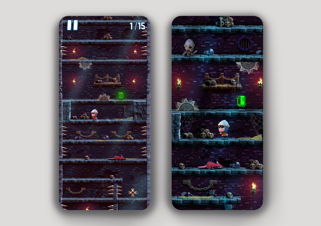
Scaling into the screenshot helped increase the number of installs slightly.
I set up an A/B test and although the analytics showed a 2% improvement in conversions I was a little disappointed that it hadn’t pushed the needle further. Undeterred I decided to try a few other things.
As well as potentially having too much detail, I also felt that each screenshot was tonally not very exciting. Sure, when the game’s in motion it’s not an issue but I felt static images weren’t doing Dungeons of Doom any justice. Also, was the user able to tell what the game was about, or how to play it even?
To address this I decided to add a frame to each screenshot. I would add text outlining key features of the game and also add imagery around each frame to help hammer home the point. Hopefully this would make each screenshot much easier for a potential user to quickly digest.
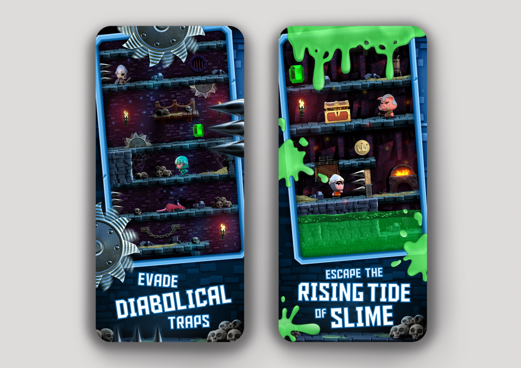
Adding a decorative border with some helpful text resulted in 18% more downloads.
I setup another A/B test and patiently waited for the results to come back. This time I was much happier with the improvement. 18% more users were installing the game with the new screenshots. It required a bit more effort to make the changes to each of the screenshots but it was certainly worth the effort.
So what should you takeaway from all this? Sometimes a screen grab of your game on its own isn’t enough. Try to add text explaining your game’s unique features or text that explains what your game is. Keep it simple though. Stick to two or three words per screenshot. And don’t be afraid to add some extra imagery to each screen that helps reinforce what you’re trying to say.
Of course, there’s no guarantee it’ll work for your game so always be prepared to A/B test against your original screen grabs.
If you liked this post then please consider following me on Twitter for more like it. Thanks!