When making a game there are many challenges along the way. But one of the biggest and often overlooked is the effort required to create a compelling user interface. Not only does it need to look good, the experience of actually using it needs to be intuitive too. That might sound easy, but the reality is somewhat different. It’s hard. Really hard!
Good graphic design skills are a necessity if you want a nice looking user interface. I’m not a graphic designer but luckily my wife Helen is! I had a rough idea of what I wanted for Dungeons of Doom but, as I found out, communicating those ideas to others isn’t easy. There were certainly several times when I thought my wife was going to strangle me. I’d ask for something then decide I didn’t like it. All these things need to go through several revisions and that unfortunately takes time and can try peoples patience. Add to that the fact that my wife’s free time is extremely limited and all those revisions unfortunately lead to months worth of work just to get a first pass.
Sitting through the process has made me appreciate all over again just how much hard work and skill goes into creating even simple dialog boxes and buttons. Making even the simplest UI component look good takes a lot of skill and effort. Take a good look at seemingly mundane dialog panels for games that are live on the App Store and you’ll suddenly realise the amount of detail and effort that has gone into even them. It might not seem important but when those details aren’t there the user can subconsciously tell something’s missing. Suddenly things start to look cheap, even amateurish, without the user being able to quite put their finger on why.
Harder still is the user experience. Navigation through the game has to be simple and feel intuitive. The user should never get lost or feel exhausted trying to work their way through the game’s various screens. One of the hardest things is deciding what information to convey to them. You need to identify what the most important buttons are, and be sure that they are clearly highlighted to the user. As the designer, the user experience might seem clear to you, but you really need to keep testing with people who have never used it. You’d be surprised at just how confused someone new to your UI might feel. Get feedback and make revisions based on it.
The right decisions really can pay off. Take my previous game, Dare the Monkey, as an example. At one point, the game’s In-App Purchase conversion rate was only about 0.5%. After some tweaks to make the game’s purchase options more visible, the IAP conversion rate jumped to around 2.5%. That’s a five fold increase! It was a massive win and something I wish I’d addressed before release to maximise revenue during the game’s feature period.
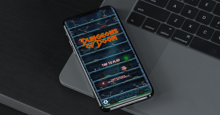
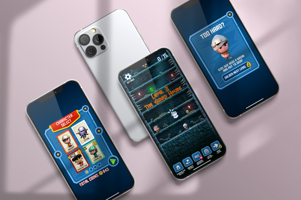
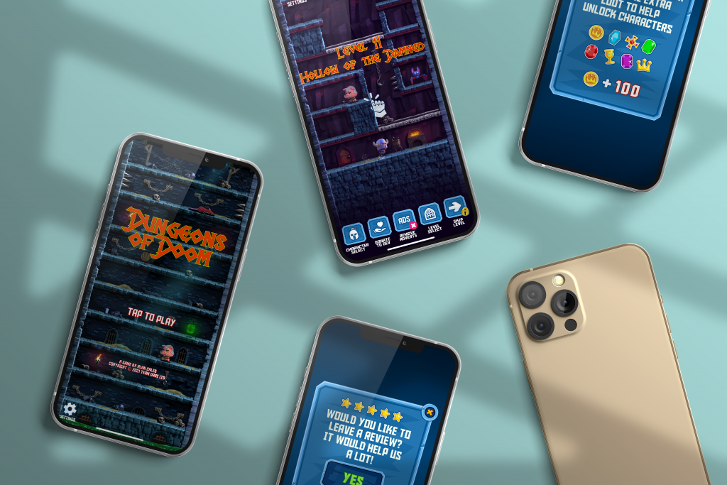
As you can see I’ve placed a few work-in-progress screen on this page showing off the current state of the user interface for Dungeons of Doom. Hope you like them.
Oh, and if you’re interested in using the template file I used to create the screenshots then you can find it here along with many more: Mockup psd created by user17882893 – www.freepik.com