My last post discussed a very simply change that helped increase Dare’s in-app purchase conversion ratio. Sticking with the ‘simple changes’ theme I’ll cover another one that helped increase my game’s IAP revenue.
Dare the Monkey is, by design, a hardcore little platformer. It’s not easy and sometimes a user can get stuck on a level. To help them out, I let users pay to skip to the next level. They can do this from a couple of locations within the game. There’s the main level select screen, and there’s also an opportunity on each level’s game over screen to skip.
But with our IAP conversion ratio flatlined at a paltry one percent we suspected that users just weren’t aware that they could pay to unlock levels. Poor sign-posting is a common problem in games, and what seems like an obvious visual cue to a developer often turns out to be far from it to a user.
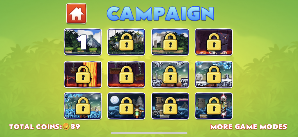
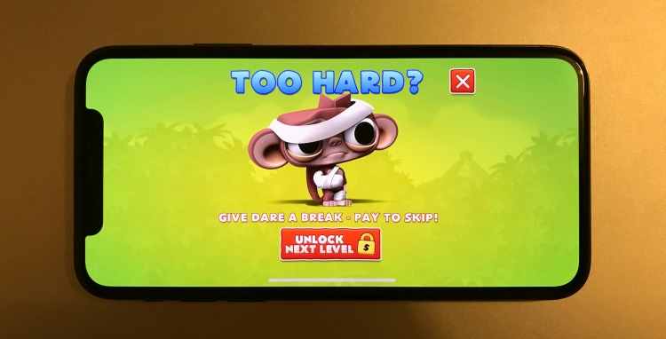
Yup, it’s hard to tell that you can tap the padlock icons.
The level select screen had nice little padlock images over each of the game’s levels. Tapping any of these padlock icons launches a native dialog asking the user if they’d like to pay to unlock the level. While it seemed perfectly obvious to me, it became apparent from talking to people that many didn’t realise they could pay to unlock a level by tapping the padlock. Instead, most simply thought it meant that they couldn’t play the level because they hadn’t yet completed the previous one.
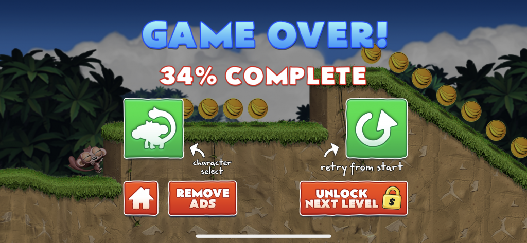
Users also often missed the level unlock button here too!
On the game over screen we’re a bit more explicit. There’s a large button with the text “Unlock next level”. It also contains the familiar padlock and dollar symbol. Once again though it was clear users just weren’t pressing it. We suspected it was for the same reason they weren’t pressing the ‘character select’ button mentioned in the previous post – they were so eager to retry the level that they simply didn’t have time to look at the other buttons on the Game Over screen.
We had so much more success when we targeted user who were actually stuck.
So what did we do? Well we decided to target users who were struggling with a particular level. Once they’d failed a certain number of times we took the opportunity to drive them to a completely new screen that asked them quite directly if they were finding the level too hard. If so, we clearly explained they could pay to skip. The screen also contained a pretty neat picture of a bruised and bandaged Dare, which gave them an obvious visual cue as to what we were asking.
With no other clutter on the screen it let the user focus on a single question and resulted in an much welcome increase in level unlocks.
I think the important thing to take away from this article is just how blind a user can become when you give them more than one option on screen. It’s also very important to find and target specific users. That way you’ll increase your chances of a user making an in-app purchase.
As always, thanks for reading!